Posts tagged ‘color trends’

April 17, 2012

Tuesday Huesday: Decorating with Tangerine Tango

By now I am sure you have heard about the hottest color of the spring, Tangerine Tango. It is everywhere, especially when it comes to clothing and home fashions. For many it may seem easier to wear this hot color, than to decorate your home with it. This orange hue is a bright, vibrant color that can scare people to use in their home. Don’t be fearful of experimenting with bright non-traditional colors in your home. There are several ways you can add a color such as tangerine tango to any room, without going overboard. Take this bedroom pictured above; it uses tangerine tango in a chic way. I found this image on HGTV. They give several other ways to decorate with Tangerine Tango, which can be found here. The bedroom above pairs this hot color against a soft blue, and neutral white color. By adding tangerine tango to these less vibrant colors, it creates a nice balance. This is something that can easily be recreated in your home, by adding colorful accessories. The next time you’re concerned about playing with color, try adding a small accessory like a pillow or chair. Are you excited or nervous to decorate your home with vibrant colors?

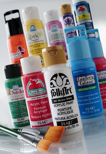
This palette was created using FolkArt acrylic paint colors: # 2252 Blue Mist, # 628 Pure Orange, # 429 Winter White, and # 452 Raw Sienna


August 30, 2011

Tuesday Huesday: 2011 Fall Fashion Colors


Autumn is fast approaching , and with a new season comes new fashion trends and colors. This year there are several new fall color trends. This fall fashion palette from the Pantone Fall Color Report, is a nice mixture of warm colors with cool metals. The mixture creates an even balance between the tones, and there is also a hint of romance that can be seen in this palette.

Bamboo, a surprising fall hue, brings a warm, exotic flavor to the season. Bamboo is a standout yellow with a subtle green undertone.

Emberglow, a traditional autumnal tone, emanates the warmth of a glowing fire – the perfect panacea to the crisp air of fall. Add a spark with shoes or a handbag in Emberglow, or perhaps a patterned scarf combining purpled Phlox or Deep Teal.

Honeysuckle, adds a bold punctuation point. This playful, reddish pink works with any other color in the palette. Flirtatious and festive, Honeysuckle produces a healthy glow – great for cosmetics and holiday soirees.

Phlox, a magical, deep purple with a hint of mystery, is an outstanding statement when worn on its own.

Cedar, is a versatile, mid-tone neutral green.

Deep Teal, a strong, blue-toned green, suggests ocean depths and the color of the sky as daylight descends into darkness.

Coffee Liqueur, brings a sense of elegance to fall, and is a savory alternative to basic black.

Nougat, is a deliciously warm camel tan.

Orchid Hush, a unique tone of gray with complex orchid undertones, blends well with any other color in the palette.

Quarry, a reliable medium gray that is a dependable staple.

We created this color palette using FolkArt Acrylic colors, Lemon Custard # 735,  Graffiti Pink #2504, Tickled Pink #319, Violet Pansy #440, Italian Sage #467, Teal #405, Bark Brown #2560, Country Twill #602, Boardwalk Blue #2487, Skyline #2499.